Google UX Design Professional Certificate
Furthering my education in UX Design, this course enabled me to:
Follow the design process: empathise with users, define pain points, ideate solutions, create wireframes and prototypes, test and iterate on designs.
Understand the basics of UX research: planning research studies, conducting interviews and usability studies, and synthesising research results
Apply foundational UX concepts: user-centred design, accessibility, and equity-focused design
Create three end-to-end projects: a mobile app, a responsive website, and a cross-platform experience.
Cinema
Project one
I selected the challenge "Design a movie trailer app for a movie theatre," as theatres have been impacted by on-demand entertainment and a global pandemic. This prompt sounded like fun to question and challenge an old industry's communication and booking process to help reinvigorate the platform and reengage users with the current technology trends.
The Problem
Cinema apps have not adapted in line with society's expectations of film information and community connection.
Users want to be better informed, often navigating to external sources to educate themselves further.
Managing friends or guest commitments and payments are complicated.
The Goal
Create easy-to-understand UI with aggregated data from leading sources.
Bridge the gap between user communication and payment, allowing users to manage group bookings with individual payments seamlessly.
Understanding the user
Summary
Personas
Problem statements
User journey maps
User Research Summary
As a UX designer, it's your job to put the user front and centre in everything.
There were two parts to conducting research for this project: primary and secondary research. The two parts gave qualitative and quantitative information for the project learning about the users I was designing for and gathering feedback about their perspectives to help empathize with users, understand their needs, and inspire new design directions. Primary research information was collected through direct interactions with users, like interviews and usability studies and secondary research was gathered from websites, articles and blogs.
Questions considered during foundational research include:
What should be built?
What are the user's problems?
How can we solve those problems?
Am I aware of my own biases, and can I filter them as I do research?
User Research Pain Points
Process
Vouchers
Users find it difficult to find where to apply a voucher code and are left feeling lost.
Process
Group Bookings
Users find it difficult to organise friends and manage payment reimbursements.
Product
Seating
Users find it difficult to discover information on seating, availability, best location and distance from the screen.
Support
Returns
Managing refunds is unclear and can be difficult, leaving the user frustrated.
User Research Meet our Personas
-
"I get bored easily."
Age: 25
Education: 4th Year, University Student
Location: Mona Vale, Sydney
Family: Single
Occupation: Marketing Intern
Taylah is a 25-year-old marketing intern. She is constantly creating connections, mobile-first, both in her work and private life. Taylah is a digital native and is always on the go. She lives life fluidly between her online and offline worlds. Taylah connects with friends online with the same immediacy and engagement as she does for her work as a Marketing intern.
Goals
To maintain a healthy work-life balance.
To be able to connect with friends on the go.
Quick, easy interactions and transactions online.
Frustrations
When websites are not mobile-friendly.
I am served content that is not relevant.
I cannot take action immediately.
Problem Statement
Taylah is a Gen Z, who needs instant connection, immediacy and engagement because Taylah is digital native, always on the go and loses interest quickly.

-
"I like to be well organised."
Age: 36
Education: BA in Computer Science
Location: Manly, Sydney
Family: Married, One Child
Occupation: Startup Founder
Jonas is a 36-year-old married startup founder with one child. Jonas has little time and budget to indulge in personal activities. He is well researched, plans and lives life on a budget. Working in Computer Science, Jonas has become accustomed to proficiencies and is frustrated when products don't meet his expectations.
Goals
To maintain a healthy work-life balance.
Not to waste any unnecessary time
Constantly educating myself
Frustrations
Having to use multiple platforms to complete a single task.
None reliable information
Roadblocks when using a product.
Problem Statement
Jonas is a father and startup founder, who needs to be well informed because as a father and founder he has little time and budget to indulge in personal activities.

User Research User Journey Mapping
After prioritisation of user needs two main goals; one, to help the user make an informed decision and two, to simplify the group booking and payment process. Two user journey tasks were created to help understand the user flow before wireframing.


Starting the Design
Paper wireframes
Digital wireframes
Low-fidelity prototype
Usability study
Design Paper Wireframes
With the two main user goals in mind, the concepts that were developed through the wireframe ideation process. One to create a high-level preview of aggregated ratings, reviews, and additional video content. With additional pages for an in-depth view. Second to ideate a process where guests could be invited to join the user and make their own individual payments.


Design Digital Wireframes
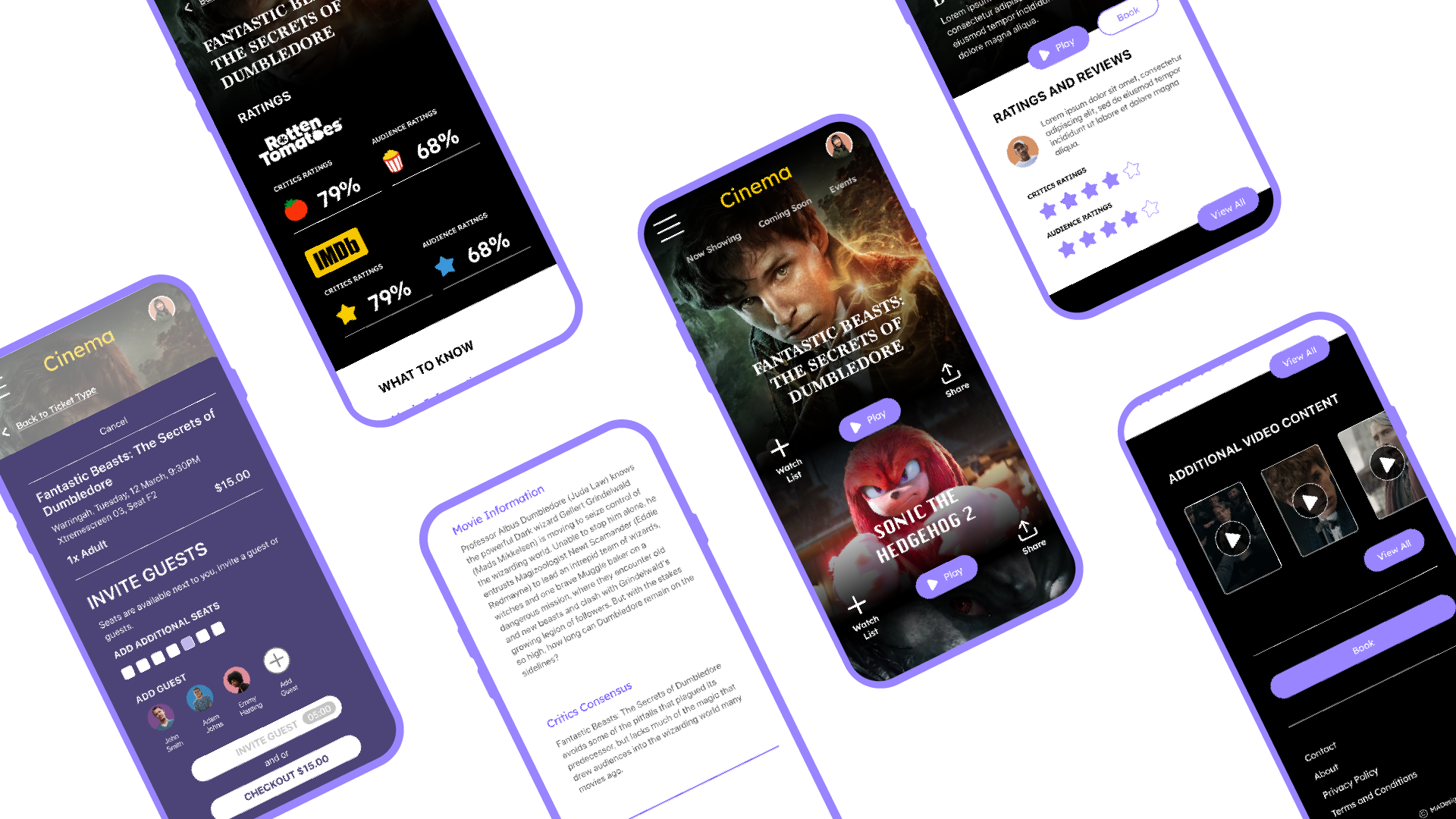
Ratings and Reviews
The design consists of a high-level preview of aggregated ratings, reviews, and additional video content on the movie title page, with additional pages for an in-depth view.


Design Digital Wireframes
Guest Invitation
The app will highlight when empty seats are available next to the users' seat selection during checkout. Guests then can be invited to join the user and make their own individual payments.


Design Low-fidelity prototype
The app aggregates ratings and reviews from external sources to help inform the user in one location. Secondly, connecting user-profiles enables users to invite guests through the booking and purchasing process that will streamline communication and payments between users.
Design Usability Study
Summary
Conduct a moderated usability study, analysis and synthesise all user feedback, gather data and observations in one place, organise the data using an affinity diagram, find themes, and develop actionable insights.
Study details
Research Questions
What can we learn from the user flow or the steps that the users take to navigate additional information (ratings and reviews, and additional video content)
What can we learn from the user flow or the steps that the users take to invite an additional user/s to the movie?
Did the user think the app was easy or difficult to use?
Are there more features that users would like to see included in the app to improve the process?
Participants
Five participants
Participants are Cinema-goers, people within geographical proximity, families, entertainment enthusiasts, primary audience
18 - 49.
One male, four females.
Methodology
15 of minutes
Australia, Remote
Moderated usability study
Users were asked to perform tasks in a low-fidelity prototype
Findings
“I don’t want to invite my friends and book the ticket and then my friends don’t go.”
Based on the theme that: it was not clear to the user how they would know if the invited user responded, an insight is: users need additional cues before confirming their individual booking.
Based on the theme that: the user did not think the time limit for guests to respond was long enough, an insight is: users need an additional communication feature.
Based on the theme that: for all users, it was not clear what action to take in selecting the profile icons, an insight is: users need better cues to identify the purpose of the profile icon.
Based on the theme that: the user interpreted the term Additional Content as any additional information, an insight is: to use accessible language (avoid jargon) when titling pages.
Based on the theme that: navigation in the app is not consistant, an insight is: to create strict consistency in navigation pathways.
Refining the design
Mockups
High-fidelity prototype
Accessibility
Next Steps
Design Mockups
Rating, Reviews and Additional Content
Based on the theme that: the user interpreted the term Additional Content as any additional information, an insight is: to use accessible language (avoid jargon) when titling pages.
Based on the theme that: navigation in the app is not consistant, an insight is: to create strict consistency in navigation pathways
Design Mockups
Invitations
Based on the theme that: it was not clear to the user how they would know if the invited user responded, an insight is: users need additional cues before confirming their individual booking.
Based on the theme that: the user did not think the time limit for guests to respond was long enough, an insight is: users need an additional communication feature.
Based on the theme that: for all users, it was not clear what action to take in selecting the profile icons, an insight is: users need better cues to identify the purpose of the profile icon.

Design High-fidelity prototype
After several iterations, the following user flows were produced in a high-fidelity prototype.
User Flow 1
Help the user make an informed decision with aggregated ratings and reviews from trusted sources.
User Flow 2
Simplify communication by creating a streamlined Share and Compose function to message friends with specific movie and booking details.
User Flow 3
Give users the option to invite guests, enabling linked individual booking payments.
Design Accessibility considerations
Research and understand the design principles that keep accessibility front-and-centre by reviewing the Accessibility Guide for Google Material.
Colour considerations by using WebAIM to help consider the overall contrast and use of colours.
Navigation considerations by designing clear layouts with distinct calls to action to help users navigate.
Design Next steps
Continue the development of accessibility. I would like to research an onboarding process that makes in-app accessibility changes based on the user's needs.
Additional to the accessibility components, look at user preferences whilst onboarding, movie genres, favourite seats and inviting guests to connect. This would allow for further engagement with users.
Continue to reiterate the current design.